Call centers as a source of data

Usability testing is a fantastic source of data on which to make design decisions. You get to see what is frustrating to users and why, first hand. Of course you know this.

There are other sources of data that you should be paying attention to, too. For example, observing training can be very revealing.  One of the richest sources of data about frustration is the call center. That is a place that hears a lot of pain.


Capturing frustration in real time

Often, the calls that people make to the call center surface issues that you’ll never hear about in usability testing. The context is different. When someone is in your usability study, you’ve given them the task and there’s a scenario in which the participants are working. This gives you control of the situation, and helps you bound the possible issues you might see. But when someone calls the call center, it could be anything from on boarding to off boarding, with everything in between as fair game for encountering frustration. The call center captures frustration in real time.

We could talk a lot about what it means that organizations have call centers, but let’s focus on what you can learn from the call center and how to do it.

Continue reading Call centers as a source of data

The essence of usability testing, in your pocket

I’ve encountered a lot of user researchers and designers lately who say to me, “I can’t do all the testing there is to do. The developers are going to have to evaluate usability of the design themselves. But they’re not trained! I’m worried about how to give them enough skills to get good data.”

What if you had a tiny guide that would give your team just the tips they need to guide them in creating and performing usability tests? It’s here!


Usability Testing Pocket Guide

This is a 32-page, 3.5 x 5-inch book that includes 11 simple steps along with a quick checklist at the end to help you know whether you’re ready to run your test.

The covers are printed on 100% recycled chipboard. The internal pages are vegetable- based inks on 100% recycled papers. The Pocket Guides are printed by Scout Books and designed by Oxide Design Co.

You can order yours here.

usability-testing-pocket-guide

Crowd-sourced research: trusting a network of co-researchers

In the fall of 2012, I seized the opportunity to do some research I’ve wanted to do for a long time. Millions of users would be available and motivated to take part. But I needed to figure out how to do a very large study in a short time. By large, I’m talking about reviewing hundreds of websites. How could we make that happen within a couple of months?

Do election officials and voters talk about elections the same way?

I had BIG questions. What were local governments offering on their websites, and how did they talk about it? And, what questions did voters have?  Finally, if voters went to local government websites, were they able to find out what they needed to know? Continue reading Crowd-sourced research: trusting a network of co-researchers

Just follow the script: Working with pro and proto-pro co-researchers

She wrote to me to ask if she could give me some feedback about the protocol for a usability test. “Absolutely,” I emailed back, “I’d love that.”

By this point, we’d had 20 sessions with individual users, conducted by 5 different researchers. Contrary to what I’d said, I was not in love with the idea of getting feedback at that moment, but I decided I needed to be a grown-up about it. Maybe there really was something wrong and we’d need to start over.

That would have been pretty disappointing – starting over – because we had piloted the hell out of this protocol. Even my mother could do it and get us the data we needed. I was deeply curious about what the feedback would be, but it would be a couple of days before the concerned researcher and I could talk. Continue reading Just follow the script: Working with pro and proto-pro co-researchers

Wilder than testing in the wild: usability testing by flash mob

It was a spectacularly beautiful Saturday in San Francisco. Exactly the perfect day to do some field usability testing. But this was no ordinary field usability test. Sure, there’d been plenty of planning and organizing ahead of time. And there would be data analysis afterward. What made this test different from most usability tests?

Usability testing is HOT

For many of us, usability testing is a necessary evil. For others, it’s too much work, or it’s too disruptive to the development process. As you might expect, I have issues with all that. It’s unfortunate that some teams don’t see the value in observing people use their designs. Done well, it can be an amazing event in the life of a design. Even done very informally, it can still show up useful insights that can help a team make informed design decisions. But I probably don’t have to tell you that.

Usability testing can be enormously elevating for teams at all stages of UX maturity. In fact, there probably isn’t nearly enough of it being done. Even on enlightened teams that know about and do usability tests, they’re probably not doing it often enough. There seems to be a correlation between successful user experiences and how often and how much the designers and developers spend time observing users. (hat tip Jared Spool) Continue reading Usability testing is HOT

Researcher as director: scripts and stage direction

For most teams, the moderator of user research sessions is the main researcher. Depending on the comfort level of the team, the moderator might be a different person from session to session in the same study. (I often will moderate the first few sessions of a study and then hand the moderating over to the first person on the design team who feels ready to take over.)

To make that work, it’s a good practice to create some kind of checklist for the sessions, just to make sure that the team’s priorities are addressed. For a field study or a formative usability test, a checklist might be all a team needs. But if the team is working on sussing out nuanced behaviors or solving subtle problems, we might want a bit more structure. Continue reading Researcher as director: scripts and stage direction

Overcoming fear of moderating UX research sessions

It always happens: Someone asks me about screwing up as an amateur facilitator/moderator for user research and usability testing sessions. This time, I had just given a pep talk to a bunch of user experience professionals about sharing responsibility with the whole team for doing research. “But what if the (amateur) designer does a bad job of moderating the session?”

What not to do

There are numerous ways in which a moderator can foul things up. Here are just a few possibilities that might render the data gathered useless:

  • Leading the participant
  • Interrupting or intervening at the wrong time
  • Teaching or training rather than observing and listening
  • Not following a script or checklist
  • Arguing with the participant

Rolf Molich and Chauncey Wilson put together an extensive list of the many wrong things moderators could do. There are dozens of behaviors on the list. I have committed many of these sins myself at some point. It’s embarrassing, but it is not the end of the world. So, here, let’s talk about what to do to be the best possible moderator in your first session. Continue reading Overcoming fear of moderating UX research sessions

Easier data gathering: Techniques of the pros

In an ideal world, we’d have one person moderating a user research session and at least one other person taking notes or logging data. In practice it often just doesn’t work out that way. The more people I talk to who are doing user research, the more often I hear from experienced people that they’re doing it all: designing the study, recruiting participants, running sessions, taking notes, analyzing the data, and reporting.

I’ve learned a lot from the people I’ve worked with on studies. Two of these lessons are key: Doing note taking well is really hard.

There are ways to make it easier, more efficient, and less stressful.

Today, I’m going to talk about a couple of the techniques I’ve learned over the years (yes, I’ll give credit to those I, um, borrowed from so you can go to the sources) for dealing with stuck participants, sticking to the data you want to report on, and making it easy to see patterns.

Continue reading Easier data gathering: Techniques of the pros

What counts: Measuring the effectiveness of your design

Let’s say you’re looking at these behaviors in your usability test:

  • Where do participants start the task?
  • How easily do participants find the right form? How many wrong turns do they take on the way? Where in the navigation do they make wrong turns?
  • How easily and successfully do they recognize the form they need on the gallery page?
  • How well do participants understand where they are in the site?

How does that turn into data from which to make design decisions?


What counts?

It’s all about what counts. What did the team observe that shows that these things happened or did not happen?

Say the team does 10 individual usability test sessions. There were 5 major “scavenger hunt” tasks. Everyone has their own stack of yellow stickies that they’ve written down observations on. (Observations of behavior, only – there should be no interpreting, projecting, guessing, or inferring yet.) Or, say the team has kept a rolling issues list. All indications are that the team is in consensus about what happened.

Example 1: Entry points

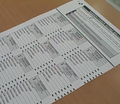
Here’s an example. For the first task, Find an account open form, the first thing the team wanted to observe for was whether participants started out where we thought they should (Forms), and if not, where participants did start.

The data looked like this:

Grid with participants in the left column and Xs for where participants visited or entered in the other columns

Seven of the 10 started out at Forms – great. That’s what the team expected based on the outcomes of card sorts. But 3 participants didn’t. But those 3 all started out at the same place. (First inference: Now the team knows there is strong scent in one link and some scent in another link.)


Example 2: Tracking navigation paths – defining “wrong turn”

Now, what about the wrong turns? In part, this depends on how the team defines “wrong turn.”

What you’re finding out in exploratory tests with early designs is where users go. Is that wrong? Not necessarily. Think of it in the same way that some landscapers and urban planners do about where to put walkways in a park. Until you can see where the traffic patterns are, there’s not a lot of point in paving. The data will tell you where to put the paths outside where the team projects the path should be.

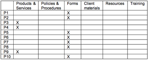
As each session goes on, the team tracks where participants went. The table below actually tracks the data for multiple issues to explore:

  • How many wrong turns do they take on the way?
  • Where in the navigation do they make wrong turns?
  • How easily and successfully do they recognize the form they need on the gallery page?


Everyone ended up at the right place. Some participants even took the path that the team expected everyone to take: Forms / Account Open / Form #10.

But the participants who started out at Products had to go back to the main navigation to get to the right place. There’s a decision to make. The team could count those as “wrong turns” or they could look at them as a design opportunity. That is, the team could put a link to Forms on the Product page – from the point of view of the user, they’re still on the “right” path and the design has prevented the user from making a mistake.

Account Open is a gallery page. Kits is the beginning of a wizard. Either way, the right form is available in the next step and all the participants chose the right one.


Measures: Everything counts

So, how do you count what counts? The team counted errors (“wrong turns”) and task successes. How important are the counts? The team could have gone with their impressions and what they remembered. There’s probably little enough data to do that. In smaller tests, your team might be comfortable with that. But in larger tests – anything over a few participants – observers typically remember the most recent sessions the best. Earlier sessions either fade in memory or the details become fuzzy. So tracking data for every session can keep the whole team honest. When there are numbers, the team can decide together what to do with them.


What we saw

This team learned that we got the high-level information architecture pretty close to right – most participants recognized where to enter the site to find the forms. We also learned that gallery pages were pretty successful; most participants picked the right thing the first or second time. It was easy to see all of this in tracking and counting what participants did.