What to do with the data: Moving from observations to design direction


This article was originally published on December 7, 2009. 


What is data but observation? Observations are what was seen and what was heard. As teams work on early designs, the data is often about obvious design flaws and higher order behaviors, and not necessarily tallying details. In this article, let’s talk about tools for working with observations made in exploratory or formative user research.

Many teams have a sort of intuitive approach to analyzing observations that relies on anecdote and aggression. Whoever is the loudest gets their version accepted by the group. Over the years, I’ve learned a few techniques for getting past that dynamic and on to informed inferences that lead to smart design direction and creating solution theories that can then be tested.


Collaborative techniques give better designs

The idea is to collaborate. Let’s start with the assumption that the whole design team is involved in the planning and doing of whatever the user research project is.

Now, let’s talk about some ways to expedite analysis and consensus. Doing this has the side benefit of minimizing reporting – if everyone involved in the design direction decisions has been involved all along, what do you need reporting for? (See more about this in the last section of this article.)

Continue reading What to do with the data: Moving from observations to design direction

Making sense of the data: Collaborative data analysis

I’ve often said that most of the value in doing user research is in spending time with users — observing them, listening to them. This act, especially if done by everyone on the design team, can be unexpectedly enlightening. Insights are abundant.

But it’s data, right? Now that the team has done this observing, what do you know? What are you going to do with what you know? How do you figure that out?


The old way: Tally the data, write a report, make recommendations

This is the *usual* sequence of things after the sessions with users are done: finish the sessions; count incidents; tally data; summarize data; if there’s enough data, do some statistical analysis; write a report listing all the issues; maybe apply severity ratings; present the report to the team; make recommendations for changes to the user interface; wait to see what happens.

There are a couple of problems with this process, though. UXers feel pressure to analyze the data really quickly. They complain that no one reads the report. And if you’re an outside consultant, there’s often no good way of knowing whether your recommendations will be implemented. Continue reading Making sense of the data: Collaborative data analysis

Easier data gathering: Techniques of the pros

In an ideal world, we’d have one person moderating a user research session and at least one other person taking notes or logging data. In practice it often just doesn’t work out that way. The more people I talk to who are doing user research, the more often I hear from experienced people that they’re doing it all: designing the study, recruiting participants, running sessions, taking notes, analyzing the data, and reporting.

I’ve learned a lot from the people I’ve worked with on studies. Two of these lessons are key: Doing note taking well is really hard.

There are ways to make it easier, more efficient, and less stressful.

Today, I’m going to talk about a couple of the techniques I’ve learned over the years (yes, I’ll give credit to those I, um, borrowed from so you can go to the sources) for dealing with stuck participants, sticking to the data you want to report on, and making it easy to see patterns.

Continue reading Easier data gathering: Techniques of the pros

What counts: Measuring the effectiveness of your design

Let’s say you’re looking at these behaviors in your usability test:

  • Where do participants start the task?
  • How easily do participants find the right form? How many wrong turns do they take on the way? Where in the navigation do they make wrong turns?
  • How easily and successfully do they recognize the form they need on the gallery page?
  • How well do participants understand where they are in the site?

How does that turn into data from which to make design decisions?


What counts?

It’s all about what counts. What did the team observe that shows that these things happened or did not happen?

Say the team does 10 individual usability test sessions. There were 5 major “scavenger hunt” tasks. Everyone has their own stack of yellow stickies that they’ve written down observations on. (Observations of behavior, only – there should be no interpreting, projecting, guessing, or inferring yet.) Or, say the team has kept a rolling issues list. All indications are that the team is in consensus about what happened.

Example 1: Entry points

Here’s an example. For the first task, Find an account open form, the first thing the team wanted to observe for was whether participants started out where we thought they should (Forms), and if not, where participants did start.

The data looked like this:
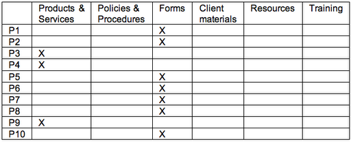
Grid with participants in the left column and Xs for where participants visited or entered in the other columns

Seven of the 10 started out at Forms – great. That’s what the team expected based on the outcomes of card sorts. But 3 participants didn’t. But those 3 all started out at the same place. (First inference: Now the team knows there is strong scent in one link and some scent in another link.)


Example 2: Tracking navigation paths – defining “wrong turn”

Now, what about the wrong turns? In part, this depends on how the team defines “wrong turn.”

What you’re finding out in exploratory tests with early designs is where users go. Is that wrong? Not necessarily. Think of it in the same way that some landscapers and urban planners do about where to put walkways in a park. Until you can see where the traffic patterns are, there’s not a lot of point in paving. The data will tell you where to put the paths outside where the team projects the path should be.

As each session goes on, the team tracks where participants went. The table below actually tracks the data for multiple issues to explore:

  • How many wrong turns do they take on the way?
  • Where in the navigation do they make wrong turns?
  • How easily and successfully do they recognize the form they need on the gallery page?


Everyone ended up at the right place. Some participants even took the path that the team expected everyone to take: Forms / Account Open / Form #10.

But the participants who started out at Products had to go back to the main navigation to get to the right place. There’s a decision to make. The team could count those as “wrong turns” or they could look at them as a design opportunity. That is, the team could put a link to Forms on the Product page – from the point of view of the user, they’re still on the “right” path and the design has prevented the user from making a mistake.

Account Open is a gallery page. Kits is the beginning of a wizard. Either way, the right form is available in the next step and all the participants chose the right one.


Measures: Everything counts

So, how do you count what counts? The team counted errors (“wrong turns”) and task successes. How important are the counts? The team could have gone with their impressions and what they remembered. There’s probably little enough data to do that. In smaller tests, your team might be comfortable with that. But in larger tests – anything over a few participants – observers typically remember the most recent sessions the best. Earlier sessions either fade in memory or the details become fuzzy. So tracking data for every session can keep the whole team honest. When there are numbers, the team can decide together what to do with them.


What we saw

This team learned that we got the high-level information architecture pretty close to right – most participants recognized where to enter the site to find the forms. We also learned that gallery pages were pretty successful; most participants picked the right thing the first or second time. It was easy to see all of this in tracking and counting what participants did.

Consensus on observations in real time: Keeping a rolling list of issues


Design teams often need results from usability studies yesterday. Teams I work with always want to start working on observations right away. How to support them while giving good data and ensuring that the final findings are valid?

Teams that are fully engaged in getting feedback from users – teams that share a vision of the experience they want their users to have – have often helped me gather data and evaluate in the course of the test. In chatting with Livia Labate, I learned that the amazing team at Comcast Interactive Media (CIM) came to the same technique on their own. Crystal Kubitsky of CIM was good enough to share photos of CIM’s progress through one study. Here’s how it works:


1. Start noting observations right away

After two or three participants have tried the design, we take a longer break to debrief about what we have observed so far. In that debrief, each team member talks about what he or she has observed. We write it down on a white board and note which participants had the issue. The team works together to articulate what the observation or issue was. Continue reading Consensus on observations in real time: Keeping a rolling list of issues