Making sense of the data: Collaborative data analysis

I’ve often said that most of the value in doing user research is in spending time with users — observing them, listening to them. This act, especially if done by everyone on the design team, can be unexpectedly enlightening. Insights are abundant.

But it’s data, right? Now that the team has done this observing, what do you know? What are you going to do with what you know? How do you figure that out?


The old way: Tally the data, write a report, make recommendations

This is the *usual* sequence of things after the sessions with users are done: finish the sessions; count incidents; tally data; summarize data; if there’s enough data, do some statistical analysis; write a report listing all the issues; maybe apply severity ratings; present the report to the team; make recommendations for changes to the user interface; wait to see what happens.

There are a couple of problems with this process, though. UXers feel pressure to analyze the data really quickly. They complain that no one reads the report. And if you’re an outside consultant, there’s often no good way of knowing whether your recommendations will be implemented. Continue reading Making sense of the data: Collaborative data analysis

You are not your user. No matter how good you think you are.


Listen up, people. This is why — quantity is not quality — you are not your user.


The lesson for today on participant sampling is Google Buzz. Google has been working on Buzz for some time. And it’s a cool idea. Integrating the sharing of photos, status updates, conversations, and email is a thing a lot of us have been looking for. Buzz makes lots of automatic connections. That’s what integrating applications means.

BUT. One of the features of Buzz was that it would automatically connect you to people whom you have emailed in Gmail. On the surface, a great idea. A slick idea, which worked really well with 20,000 Google employees.

Large samples do not always generate quality data
Twenty thousand. Feedback from 20,000 people is a lot of data. How many of us would kill to have access to 20,000 people? So. How can such a large sample be bad? Large samples can definitely generate excellent data on which to make superfine design decisions. Amazon and Netflix use very large samples for very specialized tests. There’s discussion everywhere, including at the recent Interaction10 conference in Savannah, about cheap methods for doing remote, unmoderated usability testing with thousands of people. More data seems like a good idea.

If you have access to 20,000 people and you can handle the amount of data that could come out of well designed research from that sample, go for it. But it has to be the right sample.

Look outside yourself (and your company)
Google employees are special. They’re very carefully selected by the company. They have skills, abilities, and lives that are very different from most people outside Google. So, there’s the bias of being selected to be a Googler. And then there’s indoctrination as you assimilate into the corporate culture. It’s a rarified environment.

But Google isn’t special in this way. Every organization selects its employees carefully. Every organization has a culture that new people undergo indoctrination and assimilation for, or they leave. In aggregate, the people in an organization begin to behave similarly and think similarly. They aspire to the same things, like wanting products to work.

But what about 37 Signals and/or Apple? They don’t do testing at all. (We don’t actually know this for sure. They may not call it testing.) They design for themselves and their products are very successful in the marketplace. I think that those companies do know a lot about their customers. They’ve observed. They’ve studied. And, over time, they do adjust their designs (look at the difference in interaction design in the iPod from first release in 2001 to now). Apple has also had its failures (Newton, anyone?).

The control thing
By not using an outside sample, Google ran into a major interaction design problem. About as big as it gets. This is a control issue, not a privacy issue, though the complaints were about over sharing. One of the cardinal rules of interaction design is to always let the user feel she’s in control. By taking control of users’ data, Buzz invaded users’ privacy. That’s the unfortunate outcome in this case, and now, users will trust Google less. It’s difficult to regain trust. But I digress.

The moral of today’s lesson: Real users always surprise us
Google miscalculated when it assumed that everyone you email is someone you want to share things with, and that you might want those people connected to one another. In a work setting, this might be true. In a closed community like a corporation, this might be true. But the outside world is much messier.

For example, I have an ex. He emails me. Sometimes, I even email him back. But I don’t want to share things with him anymore. We’re not really friends. I don’t want to connect him to my new family.

Even testing with friends and family might have exposed the problem. Google has a Trusted Tester program. Though there are probably some biases in that sample because of the association with Google employees, they are not Google employees. This makes friends and family who use Gmail one step closer to typical users. But Google didn’t use Trusted Testers for Buzz.

You get to choose your friends in real life. Google could have seen this usage pattern pretty quickly just by testing with a small sample who live beyond the Google garden walls.

User interfaces make Fast Company’s biggest design moments of the last decade

Of the 14 items that Fast Company chose to include in its selection of the biggest design moments of the years 2000-2009, there were five that were notable for their importance as breakthroughs in user interface and user experience design.
Three were specifically related to technology. I’m guessing that most of us will not think of the others as either technology or as part of a user experience design.
iPod
There was, of course Apple’s iPod, introduced in 2001. The iPod isn’t a great piece of audio technology, and never has been. But it is a cool, fun, fashion statement that integrates nearly seamlessly with Apple’s other products, especially iTunes. So there’s the experience. But the iPod also created a new look for selecting songs on a small device, which interestingly, has evolved over the decade from a multi-button (circle within a circle) user interface physical click to a slick, integrated multi-purpose magic circle that’s closer to gestural.
    2001
2009

Apple.com

Wii
In 2006 the Wii rocked video gaming by making games interactive in a very different way – no more joy stick, no more keyboard – and creating games that inspired people to be more physically active.

Nintendo.com

Multi-touch screens and gestural interfaces, large and small
Can you say, “I love my iPhone”? I do. Giving the feeling of interacting more directly with the phone, music, games, photos, and other applications, touch screens are finding their way into nearly every UI with a screen. Always good? Maybe not. But it’s a good experiment, probably on the way to something better. I just wish someone could figure out a way for me to use my iPhone when it’s 30 degrees out and I have gloves on.
 multi-touch-screen.com 

Blackberry.com
 The above technologies all fit neatly into many lives these days and affect a much larger user experience. These elegant UIs are on things that most people would consider non-essential. Design made big inroads in healthcare, democracy, and sustainability, too. But there were two more important user interface design accomplishments featured by Fast Company that made huge differences in how many people take medicine and how many more will vote in elections in the future.


Clear Rx from Target
Deborah Adler created a beautifully designed package for Target’s Design For All campaign in 2005. But the package is just a vehicle for clearer, more readable labels with larger type that make taking medicine safer. In addition, Adler created other effective and beautiful, brilliant ways of identifying which drug is in the bottle and who should be taking it, with cleverly labeled the tops for quick recognition, and color coding by family member.

Target.com
Design for Democracy 
Perhaps the most important design moment of the last decade was the US presidential election in 2000 because it inspired the AIGA to institutionalize a project that had started in 1998 called Design for Democracy. The project was commissioned by the US Elections Assistance Commission to create design guidelines, templates, and specifications for optical scan ballots, election signage, and other election-related materials. I am very proud of having been involved as a consulting expert on the research led by Mary Quandt for the Effective Designs for the Administration of Federal Elections to develop the guidelines, which were published in 2007.
Call your county elections office and ask them to adopt the guidelines now. Offer to help them do it. Counties that have already adopted these best practice design guidelines for ballots have encountered happier, more confident voters, and lower costs for litigation and recounts – improving the experience of elections all the way around.

aiga.org/design-for-democracy
May Design have fewer serious problems to solve and more fun to create in the new decade.EDITED 1/21/2010 to add:
Scot Marvin wrote to tell me that his brilliant wife, Tara Starr, had cleverly doctored a pair of regular, knitted gloves to use with her iPhone, by sewing lovely flowers on the fingertips using conductive thread. The thread produces a working connection between the finger and the iPhone through the glove. Love it. 


Easier data gathering: Techniques of the pros

In an ideal world, we’d have one person moderating a user research session and at least one other person taking notes or logging data. In practice it often just doesn’t work out that way. The more people I talk to who are doing user research, the more often I hear from experienced people that they’re doing it all: designing the study, recruiting participants, running sessions, taking notes, analyzing the data, and reporting.

I’ve learned a lot from the people I’ve worked with on studies. Two of these lessons are key: Doing note taking well is really hard.

There are ways to make it easier, more efficient, and less stressful.

Today, I’m going to talk about a couple of the techniques I’ve learned over the years (yes, I’ll give credit to those I, um, borrowed from so you can go to the sources) for dealing with stuck participants, sticking to the data you want to report on, and making it easy to see patterns.

Continue reading Easier data gathering: Techniques of the pros

Beyond frustration: 3 levels of happy design

Most of us in the UX disciplines are here: Users can use the design, but they’re not excited about it. You already know about eliminating frustration. The team is constantly working to remove obstacles and hindrances that prevent users from reaching their goals. Ideally, through remedying those problems, you’ll gain users’ trust. But it’s more than that. The sites we’ll look at here know that trust is tied to how well the design team anticipates users’ needs.

Isn’t it your secret wish that you’d like users to be in love with your design? You’d like them to enjoy using it. Look forward to using it. Maybe even miss it when they’re not able to get to it.

Creating remarkable design
The thing is, creating a lovable, remarkable experience versus a just satisfactory one can seem unattainable. As Jared Spool has said, “Too often, we choose a design because it’s doable, not because it’s the best we could do.” We want to make the ship date. Or there are internal or external pressures or constraints on the team and the design.

But there are companies making their customers happy – so happy that the users engage willingly, sometimes even with longing. It comes down to three levels of happiness, according to psychological research done by Martin Seligman and others. The levels of happiness are progressive and commingled, but they come down to these:

  • Mindfulness
  • Flow
  • Meaning

Let’s talk about how this manifests in user experience design.

Three levels of happiness in user experience design

Mindfulness in design is about a pleasing awareness. In relationships, it can mean infatuation. It’s knowing that this is good, it makes me happy. It’s satisfying.

Flow, from work done by Mihaly Csikszentmihalyi, comes from immersion, absorption, the beta waves rocking the brain so you forget about the task you’re doing to become one with what is happening. There’s no time between tool time and goal time.

Meaning comes from a feeling of fellowship, contributing, and making the world a better place. As I say, I didn’t make this up. Most of these ideas come from Martin Seligman, with help from Don Norman, and Stuart Brown. (Read to the end of the newsletter for links to sources from them that inspired me). It occurred to me after studying them and watching users perform with designs, that there was a connection there.

A counter example
First, let’s talk about what not to do.

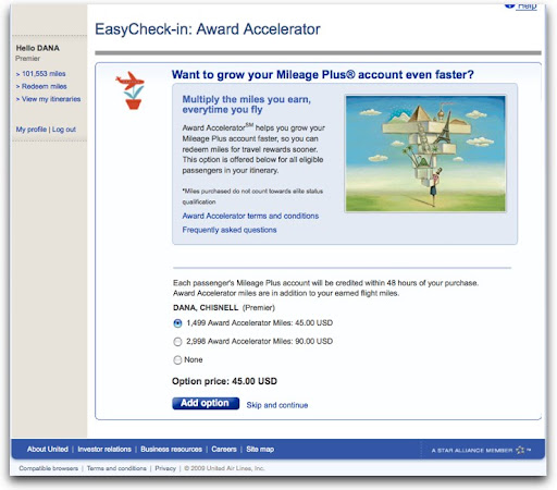
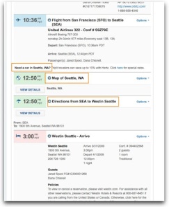
Here, the traveler is checking in for a flight online. The page she’s just come from has asked all the necessary questions about carrying hazardous materials, checking bags, and so on. Wanting to move on to getting the best possible seat, there’s this:


Note the defaults. There are interesting interactions here that go well beyond frustrating to downright annoying. Yeah, let’s buy a couple of thousand “award” miles right now, which is an “option.” What happens when our traveler clicks the Add option button without thinking? She’s sent to a shopping cart. Further and further away from the goal of checking in to a flight. Not the optimum moment for selling something.

What this feels like is an act of desperation. We can’t make you like us, but we can make you spend money, even if we have to trick you into doing it. That is not a happy experience.

Today, I’m going to focus on three favorites: TripIt, Netflix, and Zipcar.

Mindfulness: TripIt
This first level of design builds in as much positive emotion as possible, helping people have the skills to engage in that positive experience. That is, having positive experiences and being aware enough that you’re savoring them. A beautiful afternoon. A perfect summer peach. Looking into the eyes of someone you love.

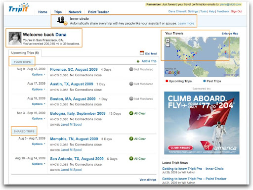
TripIt.com shows consideration and thoughtfulness – there’s a pleasing awareness of the user throughout the user interface, not only of who the user is, but that the person has relationships other than the one with TripIt. It tries to anticipate the user’s needs.


Here, the page shows some standard stuff. When the user logs in, there’s a picture, and a welcome, but there are other nice features, like showing upcoming and past trips on a map, listing the trips of people she’s shared itineraries with, and offering an option to share all trips in particular relationships.


Now drilling into an itinerary, TripIt anticipates needs like the best travel agent would, with a link to rent a car – which is a very subtle cross sell, at just the moment when the user might be thinking about that – along with other useful trip information so the user can find her way around on arriving.

It’s really easy to get used to this kind of attention. Users begin to expect this level of happiness pretty quickly. Soon, the relationship is taken for granted by the user.

Flow: Netflix
How many times have you been to your Netflix queue only to look up a half hour later realizing that you’ve just spent 30 minutes rating movies? Here we have contentment, understanding, immersion, and trust. Time stands still in a good way.

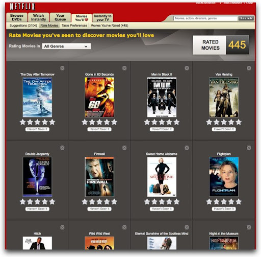
Using Netflix, I’ve seen users become completely absorbed. It starts by clicking a star in an email. It’s a simple call to action.


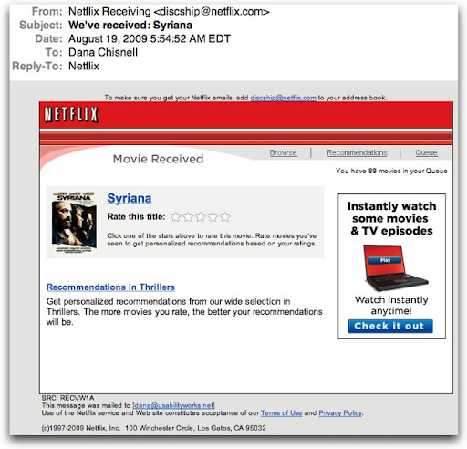
The star ratings take you to the Netflix web site, where it now offers you other movies it thinks you will like, asking you to rate the ones you’ve already seen.


It’s a natural extension of the same task. Even people who say that they don’t rate things on other sites have said in my research that they just get completely sucked in. They rate a few movies, and look up to find that 30 or 40 minutes have flown by. But it’s not like spending time on other sites (like Facebook). This is useful. The more you rate, the better the suggestions are that the site makes.

Netflix even talks about love – they’re not called suggestions, they’re called “Movies You’ll Love.” It does seem to adore users, and users adore it as it continues to offer them things that they are likely to like. As users add movies to queues, it offers yet more. Every page of movies is like a group of gifts. What’s not to like about that? Give me more and keep it coming.

Meaning: Zipcar
Yes, people get meaning from the web, and not just from social media. Meaning comes from belonging, reflectiveness, contributing, making a difference, commitment – being involved in something bigger than you.

Zipsters – that’s what people who sign up for Zipcar are called – who I’ve talked to about their experiences with the service are radiant when they describe their interactions with the company, glowing with purpose and pleasure at the same time.

Zipcar encompasses mindfulness and flow as well as meaning – the nirvana of experience design.

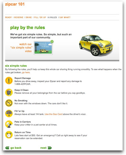
Reserving a car is pleasant, even cute.


The flow of Zipcar comes from how quickly and easily it is incorporated into members’ lives. The people in charge of the experience seem to have taken into account everything important, from how easy it is to reserve to how easy it is to extend a reservation, all the while keeping a fun, whimsical tone.

But it goes well beyond just ease of use. The idea of Zipcar is simple: rent a car by the hour. This works great for people who live in expensive, dense, urban areas where owning a car isn’t necessary and sometimes is downright inconvenient. Zipcar’s commercial premise is inexpensive convenience. But everything about using the service says “sharing.” The rules are simple, and all about being considerate of the other people who use “your” car.


Zipsters at a cocktail mixer sponsored by Zipcar (to which no one drove, by the way), many of whom said they joined just for the convenience of the service, said that they loved the environmental, sustainable aspects of being a member. This goes beyond just social networking online. People who had never known one another before met face to face because they were excited about their experiences with the service so far, and found themselves effortlessly becoming involved with the company and one another, signing up for community based activities sponsored by Zipcar. This was the germ of a real community forming within real neighborhoods, mediated through a service that is self-served on the Web. Customers see themselves as members, but forget about themselves instead thinking about making a difference in the world. Magic.

Design happiness in to the experience
Want your users to fall in love with your designs? Fall in love with your users. The companies I’ve showcased here are just a few that have done that. And it shows. That’s how users become excited about designs – being desired is very seductive.

:: :: :: :: ::::> Related links
TED Talks:
The psychology of happiness – Martin Seligman
http://www.ted.com/talks/lang/eng/martin_seligman_on_the_state_of_psychology.html

TED Talks: Play is more than fun – Stuart Brown
http://www.ted.com/talks/lang/eng/stuart_brown_says_play_is_more_than_fun_it_s_vital.html

TED Talks : Happy design – Stefan Sagmeister
http://www.ted.com/talks/lang/eng/stefan_sagmeister_shares_happy_design.html

Emotional Design: Why We Love (or Hate) Everyday Things, by Donald Norman

Happiness: A History, by Darrin M. McMahon

Flow: The Psychology of Optimal Experience by Mihaly Csikszentmihalyi

:: :: :: :: ::

:::> Come see me!
Hear me speak Sept. 21 and 22 at the EdUI conference in at the University of Virginia, where I’ll be talking about “Usability Testing Without The Scary.”

I’ll be capping off the summer by going back to college! Well, actually I’ll be speaking at one. The University of Virginia in Charlottesville, Virginia is hosting a two-day conference for web professionals in higher ed. The speaking line-up looks pretty exciting, featuring Jared Spool, Molly Holzschlag, Derek Featherstone, Dan Rubin, and of course yours truly, among others. There’ll be a broad coverage of a lot of universally useful information about usability, accessibility, design, coding, and social media, with a little higher-ed-specific content thrown in as well. View the full program at http://eduiconf.org.

:::> I have moved!
After 20 years in the San Francisco Bay Area, I’ve bugged out. As of September 1, I will be operating out of my new office and home in Andover, Massachusetts. I’m excited about this move. It’s big!
You can still find me at www.usabilityworks.net, email me at dana@usabilityworks.net, on Twitter as danachis, and on the phone at 415.519.1148.

Testing in the wild, seizing opportunity

When I say “usability test,” you might think of something that looks like a psych experiment, without the electrodes (although I’m sure those are coming as teams think that measuring biometrics will help them understand users’ experiences). Anyway, you probably visualize a lab of some kind, with a user in one room and a researcher in another, watching either through a glass or a monitor.

It can be like that, but it doesn’t have to. In fact, I’d argue that for early designs it shouldn’t be like that at all. Instead, usability testing should be done wherever and whenever users normally do the tasks they’re trying to do with a design.

Usability testing: A great tool
It’s only one technique in the toolbox, but in doing usability testing, teams get crisp, detailed snapshots about user behavior and performance. As a bonus, gathering data from users through observing them do tasks can resolve conflict within a design team or assist in decision-making. The whole point is to inform the design decisions that teams are making already.

Lighten up the usability testing methodology
Most teams I know start out thinking that they’re going to have a hard time fitting usability testing into their development process. All they want is to try out early ideas, concepts and designs or prototypes with users. But reduced to its essence, usability testing is simple:

  • Develop a test plan and design
  • Find participants
  • Gather the data by conducting sessions
  • Debrief with the team

That test plan/design? It can be a series of lists or a table. It doesn’t have to be a long exposition. As long as the result is something that everyone on the team understands and can agree to, you have written enough. After that, improvising is encouraged.

The individual sessions should be short and focused on only one or two narrow issues to explore.

But why bother to do such a quick, informal test?
First, doing any sort of usability test is good for getting input from users. The act of doing it gets the team one step closer to supporting usable design. Next, usability testing can be a great vehicle for getting the whole team excited about gathering user data. There is nothing like seeing a user use your design without intervention.

Most of the value in doing testing – let’s say about 70% – comes from just watching someone use a design. Another valuable aspect is the team working together to prepare for a usability test. That is, thinking about what Big Question they want answered and how to answer it. When those two acts align, having the team discuss together what happened in the sessions just comes naturally.

When not to do testing in the wild: Hard problems or validation
This technique is great for proving concepts or exploring issues in formative designs. It is not the right tool if the team is facing subtle, nuanced, or difficult questions to answer. In those cases, it’s best to go with more rigor and a test design that puts controls on the many possible variables.

Why? Well, in a quick, ad hoc test in the wild, the sample of participants may be too small. If you have seized a particular opportunity (say, with a seatmate on an airplane or a bus, as I have been known to do – yeah, you really don’t want me to sit next to you on a cross-country flight), a sample of one may not be enough to instill confidence with the rest of the team.

It might also happen, because the team is still forming ideas, that the approach in conducting sessions is not consistent from session to session. When that goes on, it isn’t bad necessarily. It can just mean that it’s difficult to draw meaningful inferences about what the usability problems are and how to remedy them.

If the team is okay with all that and ready to say, “let’s just do it!” to usability testing in the wild, then you can just do more sessions.

So, there are tradeoffs
What might a team have to consider in doing quick, ad hoc tests in the wild rather than a larger, more formal usability test? If you’re in the right spot in a design, for me doing usability testing in the wild is a total win:

  • You have some data, rather than no data (because running a larger, formal test is daunting or anti-Agile).
  • The team gets a lot of energy out of seeing people use the design, rather than arguing among themselves in the bubble of the conference room.
  • Quick, ad hoc testing in the wild snugs nicely into nearly any development schedule; a team doesn’t have to carve out a lot of time and stop work to go do testing.
  • It can be very inexpensive (or even free) to go to where users are to do a few sessions, quickly.

Usability testing at its essence: something, someone, and somewhere
Just a design, a person who is like the user, and an appropriate place – these are all a team needs to gather data to inform their early designs. I’ve seen teams whip together a test plan and design in an hour and then send a couple of team members to go round up participants in a public place (cafes, trade shows, sporting events, lobbies, food courts). Two other team members conduct 15- to 20-minute sessions. After a few short sessions, the team debriefs about what they saw and heard, which makes it simple to agree on a design direction.

It’s about seizing opportunity
There’s huge value in observing users use a design that is early in its formation. Because it’s so cheap, and so quick, there’s little risk of making a mistake in making inferences from the observations because a team can compensate for any shortcomings of the informality of the format by doing more testing – either more sessions, or another round of testing as follow-up. See a space or time and use it. It only takes four simple steps.

Tools for plotting a future course of design, checking progress

“Let’s check this against the Nielsen guidelines for intranets,” she said. We were three quarters of the way through completing wireframes for a redesign. We had spent 4 months doing user research, card sorting, prototyping, iterating, and testing (a lot). At the time, going back to the Nielsen Norman Group guidelines seemed like a really good idea. “Okay,” I said. “I’m all for reviewing designs from different angles.”

There are 614 guidelines.

This was not a way to check designs to see if the team had gone in the right design direction.


Are you designing or inspecting?

They are not interchangeable, guidelines and heuristics, but many UXers treat them that way. It’s common to hear someone saying that they’re doing a heuristic evaluation against X guidelines. But it doesn’t quite work like that.

Designing is an act of creation, whether you’re doing research, drawing on graph paper, or coding CSS. Inspecting is an act of checking, of examining, often with some measure in mind.

Guidelines are statements of direction. They’re about looking to the future and what you want to incorporate in the design. Guidelines are aspirational, like these:

  • Add, update, and remove content frequently.
  • Provide persistent navigation controls.
  • Index all intranet pages.
  • Provide org charts that can be viewed onscreen as well as printed.*

Heuristics challenge a design with questions. The purpose of heuristics is to provide a way to “test” a design in the absence of data by making an inspection. Heuristics are about enforcement, like these:

Visibility of system status

The system should always keep users informed about what is going on…

Match between system and the real world

The system should speak the users’ language…*

User control and freedom

The system should provide a clearly marked “emergency exit” to leave the unwanted state … **


Creating or diagnosing?

Heuristics are often cast as pass/fail tests. Does the UI comply or not? While you could use the usability.gov guidelines to evaluate web site designs, they were developed as tools for designing. They present things to think about as teams make decisions.

Both guidelines and heuristics are typically broad and interpretable. They’re built to apply to nearly interface. But they come into play at different points in a design project. Guidelines are things to think about in reaching a design; they are considerations and can interact with one another in interesting ways. Heuristics are usually diagnostic and generally don’t interact.


Don’t design by guidelines alone

For example, on the intranet project, we looked at guidelines about the home page. One directive says to put the most important new information on the home page, and the next one says to include key features and company news on the home page. A third says to include tools with information that changes every day. But earlier in the list of guidelines, we see a directive to be “judicious about having a designated ‘quick links’ area.” Guidelines may feel complementary to one another or some may seem to cancel others out. Taken together, there’s a set of complex decisions to make just about the home page.

And it was too late on our intranet to pay attention to every guideline. The decisions had been made, based on stakeholder input, business requirements, and technology constraints, as well as user requirements. Though we were thoughtful and thorough in designing, anyone scoring our site against the guidelines might not give us good marks.


Don’t evaluate by heuristics alone

Likewise, when looking at heuristics such as “be consistent,” there’s a case for conducting usability tests with real users. For example, on the intranet I was working on, one group in the client company was adamant about having a limited set of page templates, with different sections of the site meeting strict requirements for color, look, and feel. But in usability testing, participants couldn’t tell where they were in the site when they moved from section to section.


Guidance versus enforcement

What are you looking for at this point in your design project? In the intranet project, we were much closer to an evaluative mode than a creation mode (though we did continue to iterate). We needed something to help us measure how far we had come. Going back to the guidelines was not the checkpoint we were looking for.

We sallied forth. The client design team decided instead to create “heuristics” from items from the user and business requirements lists generated at the beginning of the project, making a great circle and a thoughtful cycle of research, design, and evaluation.

I don’t know whether the intranet we designed meets all of the guidelines. But users tell us and show us every day that it is easier, faster, and better than the old intranet. For now, that’s enough of a heuristic.


* From “Intranet Usability: Design Guidelines from Studies with Intranet Users” by Kara Pernice Coyne, Amy Schade, and Jakob Nielsen

** From Jakob Nielsen’s 10 heuristics, see http://www.useit.com/papers/heuristic/heuristic_list.html


Related:

Where do heuristics come from?

What are you asking for when you ask for heuristic evaluation?

Where do heuristics come from?

Recently I had the honor and pleasure of working on a project for the National Institute of Standards and Technology (NIST) to develop style guidelines for voting system documentation. Yawner, right? Not at all, it turns out. It made me think about where guidelines and heuristics come from for all kinds of design. Yes, if you live in the United States, you paid for me to find this out. Thank you.

What I learned in the process of developing style guidelines for voting system documentation (which, astonishingly took about a year) is that most heuristics — accepted principles — used in evaluating user interfaces come from three sources: Lore or folk wisdom, specialist experience, and research.

Continue reading Where do heuristics come from?

What are you asking for when you ask for a heuristic evaluation?

Every usability professional I know gets requests to do heuristic evaluations. But it isn’t always clear that the requester actually knows what is involved in doing a heuristic evaluation. Some clients who have asked me to do them have picked up the term “heuristic evaluation” somewhere but often are not clear on the details. Typically, they have mapped “heuristic evaluation” to “usability audit,” or something like that. It’s close enough to start a conversation.

Continue reading What are you asking for when you ask for a heuristic evaluation?

What counts: Measuring the effectiveness of your design

Let’s say you’re looking at these behaviors in your usability test:

  • Where do participants start the task?
  • How easily do participants find the right form? How many wrong turns do they take on the way? Where in the navigation do they make wrong turns?
  • How easily and successfully do they recognize the form they need on the gallery page?
  • How well do participants understand where they are in the site?

How does that turn into data from which to make design decisions?


What counts?

It’s all about what counts. What did the team observe that shows that these things happened or did not happen?

Say the team does 10 individual usability test sessions. There were 5 major “scavenger hunt” tasks. Everyone has their own stack of yellow stickies that they’ve written down observations on. (Observations of behavior, only – there should be no interpreting, projecting, guessing, or inferring yet.) Or, say the team has kept a rolling issues list. All indications are that the team is in consensus about what happened.

Example 1: Entry points

Here’s an example. For the first task, Find an account open form, the first thing the team wanted to observe for was whether participants started out where we thought they should (Forms), and if not, where participants did start.

The data looked like this:

Grid with participants in the left column and Xs for where participants visited or entered in the other columns

Seven of the 10 started out at Forms – great. That’s what the team expected based on the outcomes of card sorts. But 3 participants didn’t. But those 3 all started out at the same place. (First inference: Now the team knows there is strong scent in one link and some scent in another link.)


Example 2: Tracking navigation paths – defining “wrong turn”

Now, what about the wrong turns? In part, this depends on how the team defines “wrong turn.”

What you’re finding out in exploratory tests with early designs is where users go. Is that wrong? Not necessarily. Think of it in the same way that some landscapers and urban planners do about where to put walkways in a park. Until you can see where the traffic patterns are, there’s not a lot of point in paving. The data will tell you where to put the paths outside where the team projects the path should be.

As each session goes on, the team tracks where participants went. The table below actually tracks the data for multiple issues to explore:

  • How many wrong turns do they take on the way?
  • Where in the navigation do they make wrong turns?
  • How easily and successfully do they recognize the form they need on the gallery page?


Everyone ended up at the right place. Some participants even took the path that the team expected everyone to take: Forms / Account Open / Form #10.

But the participants who started out at Products had to go back to the main navigation to get to the right place. There’s a decision to make. The team could count those as “wrong turns” or they could look at them as a design opportunity. That is, the team could put a link to Forms on the Product page – from the point of view of the user, they’re still on the “right” path and the design has prevented the user from making a mistake.

Account Open is a gallery page. Kits is the beginning of a wizard. Either way, the right form is available in the next step and all the participants chose the right one.


Measures: Everything counts

So, how do you count what counts? The team counted errors (“wrong turns”) and task successes. How important are the counts? The team could have gone with their impressions and what they remembered. There’s probably little enough data to do that. In smaller tests, your team might be comfortable with that. But in larger tests – anything over a few participants – observers typically remember the most recent sessions the best. Earlier sessions either fade in memory or the details become fuzzy. So tracking data for every session can keep the whole team honest. When there are numbers, the team can decide together what to do with them.


What we saw

This team learned that we got the high-level information architecture pretty close to right – most participants recognized where to enter the site to find the forms. We also learned that gallery pages were pretty successful; most participants picked the right thing the first or second time. It was easy to see all of this in tracking and counting what participants did.