Just follow the script: Working with pro and proto-pro co-researchers

She wrote to me to ask if she could give me some feedback about the protocol for a usability test. “Absolutely,” I emailed back, “I’d love that.”

By this point, we’d had 20 sessions with individual users, conducted by 5 different researchers. Contrary to what I’d said, I was not in love with the idea of getting feedback at that moment, but I decided I needed to be a grown-up about it. Maybe there really was something wrong and we’d need to start over.

That would have been pretty disappointing – starting over – because we had piloted the hell out of this protocol. Even my mother could do it and get us the data we needed. I was deeply curious about what the feedback would be, but it would be a couple of days before the concerned researcher and I could talk. Continue reading Just follow the script: Working with pro and proto-pro co-researchers

Coming soon…

There’s a usability testing revival going on. I don’t know if you know that.

This new testing is leaner, faster, smarter, more collaborative, and covers more ground in less time. How does that happen? Everyone on the team is empowered to go do usability testing themselves. This isn’t science, it’s sensible design research. At it’s essence, usability testing is a simple thing: something to test, somewhere that makes sense, with someone who would be a real user.

But not everyone has time to get a Ph.D. in Human Computer Interaction or cognitive or behavioral psychology. Most of the teams I work with don’t even have time to attend a 2-day workshop or read a 400-page manual. These people are brave and experimental, anyway. Why not give them a tiny, sweet tool to guide them, and just let them have at it? Let us not hold them back. Continue reading Coming soon…

Heuristics for understanding older adults as web users

In 2004, Ginny Redish and I, along with Amy Lee, conducted a review of the relevant literature — research by other people — about designing for older adults (people over age 50). Doing this changed my thinking about universal design.

It wasn’t enough to generate design heuristics. We also came up with ways to operationalize them. That is, you can actually test to see if you have implemented these design practices by answering several questions about each heuristic.

Here’s an article from Technical Communication (which, by the way, was the runner-up for best article of the year for that publication) in which we describe the project, list the heuristics, and talk about some of our results in using them.

Designing for older adults: Reviewing 50 websites


AARP, an American organization for people over age 50, commissioned Ginny Redish and me to give them a scorecard of how well the Web was supporting older people in terms of design. We weren’t to evaluated sites only directed at older adults, but do conduct a broad review of sites that regular people might encounter on any given day, regardless of age.

Ginny and I came up with an unusual method to do this review: persona-based, task-driven heuristic evaluation. Very simply, we tried to take on the personalities of one of two personas, Matthew and Edith, as we did tasks they would do on sites they would normally visit. And then we rated those interactions against a set of heuristics for good design for older people.

See the results. Though this report was published several years ago (2005), the findings are pretty solid.

Ending the opinion wars: fast, collaborative design direction

I’ve seen it dozens of times. The team meets after observing people use their design, and they’re excited and energized by what they saw and heard during the sessions. They’re all charged up about fixing the design. Everyone comes in with ideas, certain they have the right solution to the remedy frustrations users had. Then what happens?

On a super collaborative team everyone is in the design together, just with different skills. Splendid! Everyone was involved in the design of the usability test, they all watched most of the sessions, they participated in debriefs between sessions. They took detailed, copious notes. And now the “what ifs” begin:

What if we just changed the color of the icon? What if we made the type bigger? What if we moved the icon to the other side of the screen? Or a couple of pixels? What if? Continue reading Ending the opinion wars: fast, collaborative design direction

The importance of rehearsing

Sports teams drill endlessly. They walk through plays, they run plays, they practice plays in scrimmages. They tweak and prompt in between drills and practice. And when the game happens, the ball just knows where to go.

This seems like such an obvious thing, but we researchers often poo-poo dry runs and rehearsals. In big studies, it is common to run large pilot studies to get the kinks out of an experiment design before running the experiment with a large number of participants.

But I’ve been getting the feeling that we general research practitioners are afraid of rehearsals. One researcher I know told me that he doesn’t do dry runs or pilot sessions because he fears that makes it look to his team like he doesn’t know what he is doing. Well, guess what. The first “real” session ends up being your rehearsal, whether you like it or not. Because you actually don’t know exactly what you’re doing — yet. If it goes well, you were lucky and you have good, valid, reliable data. But if it didn’t go well, you just wasted a lot of time and probably some money. Continue reading The importance of rehearsing

Wilder than testing in the wild: usability testing by flash mob

It was a spectacularly beautiful Saturday in San Francisco. Exactly the perfect day to do some field usability testing. But this was no ordinary field usability test. Sure, there’d been plenty of planning and organizing ahead of time. And there would be data analysis afterward. What made this test different from most usability tests?

Are you testing for delight?


Maybe you just read Jared Spool’s article about deconstructing delight. And maybe you want to hear my take, since Jared did such a good job of shilling for my framework. 

Here’s a talk I did a couple of years ago, but have been doing for a while. Have a listen.  (The post below was originally published in May, 2012.)

Everybody’s talking about designing for delight. Even me! Well, it does get a bit sad when you spend too much time finding bad things in design. So, I went positive. I looked at positive psychology, and behavioral economics, and the science of play, and hedonics, and a whole bunch of other things, and came away from all that with a framework in mind for what I call “happy design.” It comes in three flavors: pleasure, flow, and meaning.

I used to think of the framework as being in layers or levels. But it’s not like that when you start looking at great digital designs and the great experiences they are part of. Pleasure, flow and meaning end up commingled.

So, I think we need to deconstruct what we mean by “delight.” I’ve tried to do that in a talk that I’ve been giving. Here are the slides:


You can listen to audio of the talk from the IA Summit here.

The form that changed *everything*

There’s a lot of crap going on in the world right now: terrorism, two major wars, and worldwide economic collapse. Let’s not forget the lack of movement on climate change and serious unrest in the Middle East and other places.

People trust governments less than ever — perhaps because of the transparency that ambient technology brings — leading to more regulation of privacy and security, but also to protests. Protests that started in Egypt have rippled around the world.

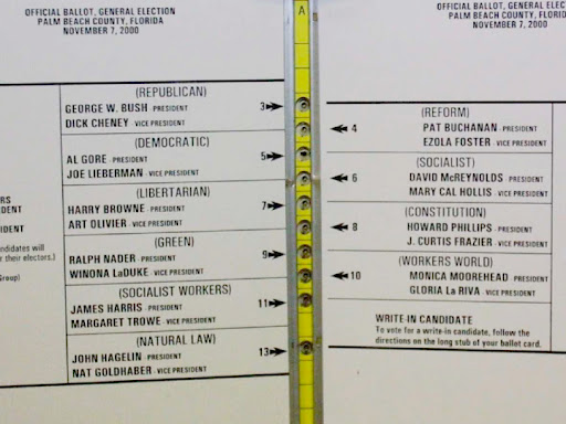
This wave started with a butterfly. Not the butterfly of chaos theory, but there is a metaphor here that should not be missed: when a butterfly flaps its wings in the Amazon rainforest, there are ripple effects that you might not realize. The butterfly I am talking about is the butterfly ballot used in Palm Beach County, Florida in the US 2000 presidential election.

Palm Beach County, Florida November 2000 ballot


Four secrets of getting great participants who show up

What if you had a near-perfect participant show rate for all your studies? The first time it happens, it’s surprising. The next few times, it’s refreshing — a relief. Teams that do great user research start with the recruiting process, and they come to expect near perfect attendance.

Secret 1: Participants are people, not data points
The people who opt in to a study have rich, complex lives that offer rich, complex experiences that a design may or may not fit into. People don’t always fit nicely into the boxes that screening questionnaires create.

Screeners can be constraining not in a good way. An agency that isn’t familiar with your design or your audience or both — and may not be experienced with user research — may eliminate people who could be great in user research or usability testing. Teams we work with find that participants who are selected through open-ended interviews conducted voice-to-voice become engaged and invested in the study. The conversation helps the participant know they’re interesting to you, and that makes them feel wanted. The team learns about variations in the user profile that they might want to design for. Continue reading Four secrets of getting great participants who show up