There’s a lot of crap going on in the world right now: terrorism, two major wars, and worldwide economic collapse. Let’s not forget the lack of movement on climate change and serious unrest in the Middle East and other places.
People trust governments less than ever — perhaps because of the transparency that ambient technology brings — leading to more regulation of privacy and security, but also to protests. Protests that started in Egypt have rippled around the world.
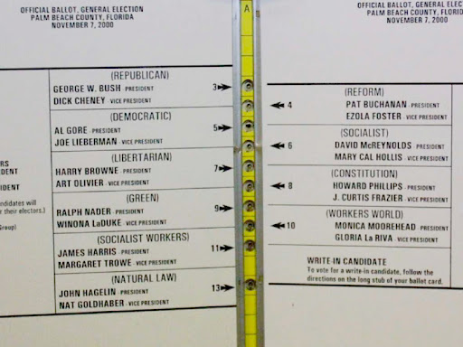
This wave started with a butterfly. Not the butterfly of chaos theory, but there is a metaphor here that should not be missed: when a butterfly flaps its wings in the Amazon rainforest, there are ripple effects that you might not realize. The butterfly I am talking about is the butterfly ballot used in Palm Beach County, Florida in the US 2000 presidential election.
 |
| Palm Beach County, Florida November 2000 ballot |
Design affects world peace
A ballot is a form. A form used in one of the most important interactions between a government and its citizens. This particular form changed everything.
This ballot, like every government form, is the culmination of a set of design decisions that were well intentioned, but also took constraints into account.
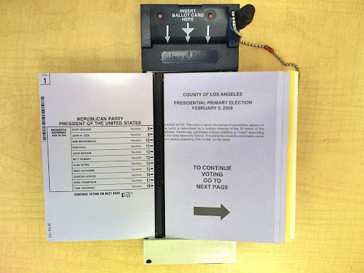
The way the voting system in Palm Beach County worked – it is no longer in use there — is that there is a little booklet mounted on a slot that a card fits in. The spine of each double page spread has a series of holes down it. The voter finds the candidate she wants to vote for, and presses a point through the hole to push a perforated box out of the card in the slot behind the little book. When you’re finished voting, you slide the card out from behind the book and drop it into a ballot box. At the end of Election Day, the cards are run through a computer to tabulate the votes. This is a computing technology from the 1960s, but for a voting system, it worked fine for a very long time.
 |
| A punchcard ballot system from Los Angeles County |
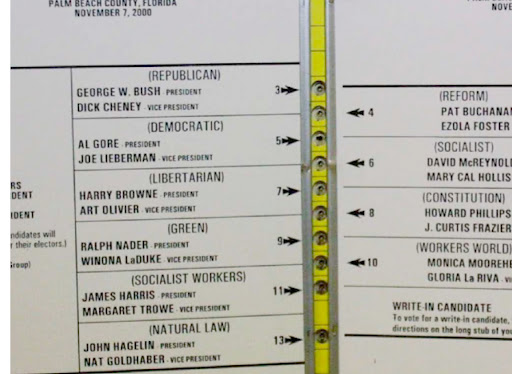
It worked until a well-intentioned public servant, who wanted to help her overwhelmingly older voters read and use the ballot, decided to make the type larger than this ballot normally allowed. In proper use of this ballot template, all the candidates are lined up on the left side of the spread. But increasing the type size flowed the candidates for president onto two pages, creating an interlaced effect. This made the choices difficult to line up properly.
 |
|
Vote for Republican candidates by punching the first hole. Vote for Democrats by punching… which?
|
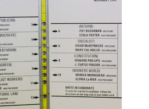
If you wanted to vote for Al Gore and Joe Lieberman, which hole do you punch? Thousands of voters thought it was the second one. It wasn’t. Punching that hole casts a vote for Pat Buchanan. Pat Buchanan is an ultra conservative, Christian fundamentalist, and a very unlikely choice for the many liberal, retired people who lived in Palm Beach County, Florida.
 |
| Vote for Reform party candidates by punching the second hole |
While the design decision seemed like the right one because it took users into account, it was done without data, without testing the new design for its usability, by someone trained and practiced in public administration, but not in design.
World peace through design: Lessons from crises
Now, there ARE amazing, excellent things going on in design that are changing the world in excitingly good ways. Many of those good things are happening in election design. Unfortunately, most of these are in response to crises. But never mind. The point is, we’re at the cusp of a movement in design for good, moving toward a future of world peace through design. Let me show you just a few examples.
After a contested election in Minnesota for a seat in the US Senate that Al Franken eventually won by just a few hundred votes, the official in charge of elections in that state decided to usability test and redesign absentee ballots there. She loved what she learned from the process so much after working on absentee ballots that her team went on to work on other important forms, such as voter registration forms.
In New York State, after being sued for usability problems with the new vote tabulating systems, the board of elections conducted usability tests on three prototyped messages. With the assistance of the voting system manufacturers, the board and a few advisors came up with messages and designs that will work on two different voting systems, within state laws, across 62 counties. The board of elections staff has also received basic training in user research, ballot design, plain language, and usability testing.
At the federal level, one response to the mortgage meltdown was to form the Consumer Finance Protection Bureau. Its first task was to rewrite and redesign disclosures given to borrowers to make them easier to read, understand, and act on. Before the mortgage crisis, borrowers didn’t understand the consequences of borrowing the types of loans they were borrowing. Design will now make a difference for both lenders and borrowers.
The thing is, design in civic life, and I would call all of these examples from civic life, is good for business. When the business of government includes design as a priority, costs of development and support are lower than when design is not consciously, actively part of the process of delivery to citizens. And business benefits from good design in civic life because it keeps regulation and costs down for suppliers. Unintended negative outcomes are much less likely when design decisions are informed by data. Simple usability tests could have prevented people voting counter to their intentions. Simple usability tests could have prevented borrowers from making decisions counter to their best interests.
Don’t let it happen again
We’ve seen what well intentioned but poor design decisions can do. (The product manager who tweaks something at the last minute?) There are some gaps in what we know about ballot design that could make the difference for thousands of voters in the next national election. Let’s learn how to design for those gaps and help local election officials make good design decisions. If you do user research and usability testing as part of your job, I encourage you to volunteer in your local election department to proofread ballots and other voter-facing materials, or be a poll worker, or both.
Don’t let the butterfly ballot happen again.

Appreciated. 🙂 Katy in Texas.