Of the 14 items that Fast Company chose to include in its selection of the biggest design moments of the years 2000-2009, there were five that were notable for their importance as breakthroughs in user interface and user experience design.
Three were specifically related to technology. I’m guessing that most of us will not think of the others as either technology or as part of a user experience design.
iPod
There was, of course Apple’s iPod, introduced in 2001. The iPod isn’t a great piece of audio technology, and never has been. But it is a cool, fun, fashion statement that integrates nearly seamlessly with Apple’s other products, especially iTunes. So there’s the experience. But the iPod also created a new look for selecting songs on a small device, which interestingly, has evolved over the decade from a multi-button (circle within a circle) user interface physical click to a slick, integrated multi-purpose magic circle that’s closer to gestural.
Apple.com
Wii
In 2006 the Wii rocked video gaming by making games interactive in a very different way – no more joy stick, no more keyboard – and creating games that inspired people to be more physically active.


Nintendo.com
Multi-touch screens and gestural interfaces, large and small
Can you say, “I love my iPhone”? I do. Giving the feeling of interacting more directly with the phone, music, games, photos, and other applications, touch screens are finding their way into nearly every UI with a screen. Always good? Maybe not. But it’s a good experiment, probably on the way to something better. I just wish someone could figure out a way for me to use my iPhone when it’s 30 degrees out and I have gloves on.
 The above technologies all fit neatly into many lives these days and affect a much larger user experience. These elegant UIs are on things that most people would consider non-essential. Design made big inroads in healthcare, democracy, and sustainability, too. But there were two more important user interface design accomplishments featured by Fast Company that made huge differences in how many people take medicine and how many more will vote in elections in the future.
Clear Rx from Target
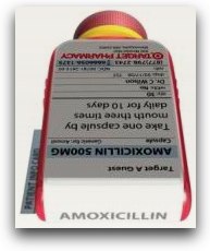
Deborah Adler created a beautifully designed package for Target’s Design For All campaign in 2005. But the package is just a vehicle for clearer, more readable labels with larger type that make taking medicine safer. In addition, Adler created other effective and beautiful, brilliant ways of identifying which drug is in the bottle and who should be taking it, with cleverly labeled the tops for quick recognition, and color coding by family member.
Design for Democracy
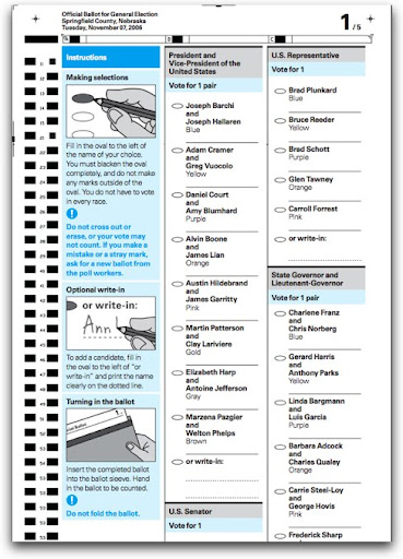
Perhaps the most important design moment of the last decade was the US presidential election in 2000 because it inspired the AIGA to institutionalize a project that had started in 1998 called Design for Democracy. The project was commissioned by the US Elections Assistance Commission to create design guidelines, templates, and specifications for optical scan ballots, election signage, and other election-related materials. I am very proud of having been involved as a consulting expert on the research led by Mary Quandt for the Effective Designs for the Administration of Federal Elections to develop the guidelines, which were published in 2007.
 Call your county elections office and ask them to adopt the guidelines now. Offer to help them do it. Counties that have already adopted these best practice design guidelines for ballots have encountered happier, more confident voters, and lower costs for litigation and recounts – improving the experience of elections all the way around.
aiga.org/design-for-democracy
May Design have fewer serious problems to solve and more fun to create in the new decade.EDITED 1/21/2010 to add:
Scot Marvin wrote to tell me that his brilliant wife, Tara Starr, had cleverly doctored a pair of regular, knitted gloves to use with her iPhone, by sewing lovely flowers on the fingertips using conductive thread. The thread produces a working connection between the finger and the iPhone through the glove. Love it.
Scot Marvin wrote to tell me that his brilliant wife, Tara Starr, had cleverly doctored a pair of regular, knitted gloves to use with her iPhone, by sewing lovely flowers on the fingertips using conductive thread. The thread produces a working connection between the finger and the iPhone through the glove. Love it.


