Most of us in the UX disciplines are here: Users can use the design, but they’re not excited about it. You already know about eliminating frustration. The team is constantly working to remove obstacles and hindrances that prevent users from reaching their goals. Ideally, through remedying those problems, you’ll gain users’ trust. But it’s more than that. The sites we’ll look at here know that trust is tied to how well the design team anticipates users’ needs.
Isn’t it your secret wish that you’d like users to be in love with your design? You’d like them to enjoy using it. Look forward to using it. Maybe even miss it when they’re not able to get to it.
Creating remarkable design
The thing is, creating a lovable, remarkable experience versus a just satisfactory one can seem unattainable. As Jared Spool has said, “Too often, we choose a design because it’s doable, not because it’s the best we could do.” We want to make the ship date. Or there are internal or external pressures or constraints on the team and the design.
But there are companies making their customers happy – so happy that the users engage willingly, sometimes even with longing. It comes down to three levels of happiness, according to psychological research done by Martin Seligman and others. The levels of happiness are progressive and commingled, but they come down to these:
Let’s talk about how this manifests in user experience design.
Three levels of happiness in user experience design
Mindfulness in design is about a pleasing awareness. In relationships, it can mean infatuation. It’s knowing that this is good, it makes me happy. It’s satisfying.
Flow, from work done by Mihaly Csikszentmihalyi, comes from immersion, absorption, the beta waves rocking the brain so you forget about the task you’re doing to become one with what is happening. There’s no time between tool time and goal time.
Meaning comes from a feeling of fellowship, contributing, and making the world a better place. As I say, I didn’t make this up. Most of these ideas come from Martin Seligman, with help from Don Norman, and Stuart Brown. (Read to the end of the newsletter for links to sources from them that inspired me). It occurred to me after studying them and watching users perform with designs, that there was a connection there.
A counter example
First, let’s talk about what not to do.
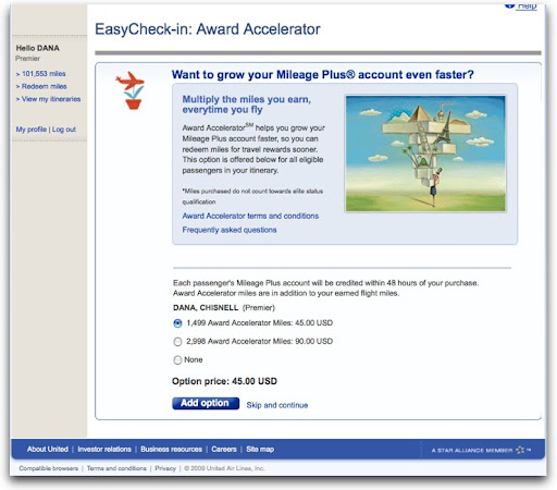
Here, the traveler is checking in for a flight online. The page she’s just come from has asked all the necessary questions about carrying hazardous materials, checking bags, and so on. Wanting to move on to getting the best possible seat, there’s this:
Note the defaults. There are interesting interactions here that go well beyond frustrating to downright annoying. Yeah, let’s buy a couple of thousand “award” miles right now, which is an “option.” What happens when our traveler clicks the Add option button without thinking? She’s sent to a shopping cart. Further and further away from the goal of checking in to a flight. Not the optimum moment for selling something.
What this feels like is an act of desperation. We can’t make you like us, but we can make you spend money, even if we have to trick you into doing it. That is not a happy experience.
Today, I’m going to focus on three favorites: TripIt, Netflix, and Zipcar.
Mindfulness: TripIt
This first level of design builds in as much positive emotion as possible, helping people have the skills to engage in that positive experience. That is, having positive experiences and being aware enough that you’re savoring them. A beautiful afternoon. A perfect summer peach. Looking into the eyes of someone you love.
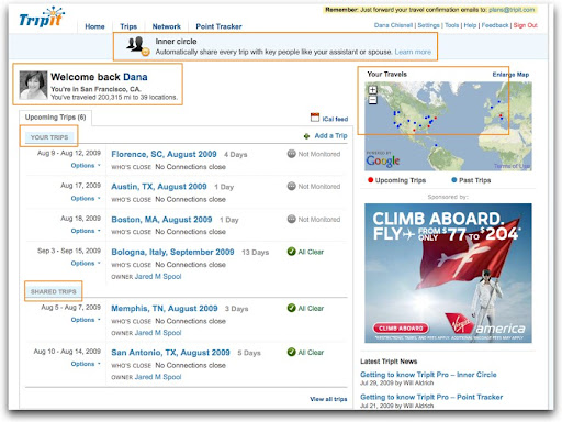
TripIt.com shows consideration and thoughtfulness – there’s a pleasing awareness of the user throughout the user interface, not only of who the user is, but that the person has relationships other than the one with TripIt. It tries to anticipate the user’s needs.

Here, the page shows some standard stuff. When the user logs in, there’s a picture, and a welcome, but there are other nice features, like showing upcoming and past trips on a map, listing the trips of people she’s shared itineraries with, and offering an option to share all trips in particular relationships.

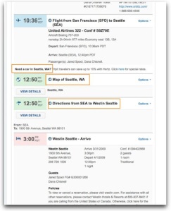
Now drilling into an itinerary, TripIt anticipates needs like the best travel agent would, with a link to rent a car – which is a very subtle cross sell, at just the moment when the user might be thinking about that – along with other useful trip information so the user can find her way around on arriving.
It’s really easy to get used to this kind of attention. Users begin to expect this level of happiness pretty quickly. Soon, the relationship is taken for granted by the user.
Flow: Netflix
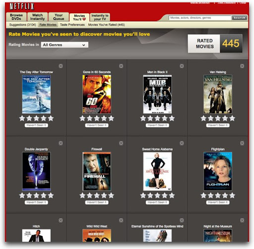
How many times have you been to your Netflix queue only to look up a half hour later realizing that you’ve just spent 30 minutes rating movies? Here we have contentment, understanding, immersion, and trust. Time stands still in a good way.
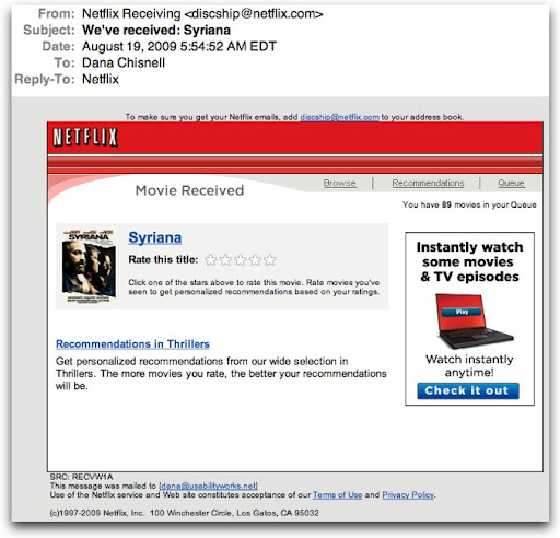
Using Netflix, I’ve seen users become completely absorbed. It starts by clicking a star in an email. It’s a simple call to action.

The star ratings take you to the Netflix web site, where it now offers you other movies it thinks you will like, asking you to rate the ones you’ve already seen.

It’s a natural extension of the same task. Even people who say that they don’t rate things on other sites have said in my research that they just get completely sucked in. They rate a few movies, and look up to find that 30 or 40 minutes have flown by. But it’s not like spending time on other sites (like Facebook). This is useful. The more you rate, the better the suggestions are that the site makes.
Netflix even talks about love – they’re not called suggestions, they’re called “Movies You’ll Love.” It does seem to adore users, and users adore it as it continues to offer them things that they are likely to like. As users add movies to queues, it offers yet more. Every page of movies is like a group of gifts. What’s not to like about that? Give me more and keep it coming.
Meaning: Zipcar
Yes, people get meaning from the web, and not just from social media. Meaning comes from belonging, reflectiveness, contributing, making a difference, commitment – being involved in something bigger than you.
Zipsters – that’s what people who sign up for Zipcar are called – who I’ve talked to about their experiences with the service are radiant when they describe their interactions with the company, glowing with purpose and pleasure at the same time.
Zipcar encompasses mindfulness and flow as well as meaning – the nirvana of experience design.
Reserving a car is pleasant, even cute.

The flow of Zipcar comes from how quickly and easily it is incorporated into members’ lives. The people in charge of the experience seem to have taken into account everything important, from how easy it is to reserve to how easy it is to extend a reservation, all the while keeping a fun, whimsical tone.
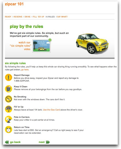
But it goes well beyond just ease of use. The idea of Zipcar is simple: rent a car by the hour. This works great for people who live in expensive, dense, urban areas where owning a car isn’t necessary and sometimes is downright inconvenient. Zipcar’s commercial premise is inexpensive convenience. But everything about using the service says “sharing.” The rules are simple, and all about being considerate of the other people who use “your” car.

Zipsters at a cocktail mixer sponsored by Zipcar (to which no one drove, by the way), many of whom said they joined just for the convenience of the service, said that they loved the environmental, sustainable aspects of being a member. This goes beyond just social networking online. People who had never known one another before met face to face because they were excited about their experiences with the service so far, and found themselves effortlessly becoming involved with the company and one another, signing up for community based activities sponsored by Zipcar. This was the germ of a real community forming within real neighborhoods, mediated through a service that is self-served on the Web. Customers see themselves as members, but forget about themselves instead thinking about making a difference in the world. Magic.
Design happiness in to the experience
Want your users to fall in love with your designs? Fall in love with your users. The companies I’ve showcased here are just a few that have done that. And it shows. That’s how users become excited about designs – being desired is very seductive.
:: :: :: :: ::::> Related links
TED Talks: The psychology of happiness – Martin Seligman
http://www.ted.com/talks/lang/eng/martin_seligman_on_the_state_of_psychology.html
TED Talks: Play is more than fun – Stuart Brown
http://www.ted.com/talks/lang/eng/stuart_brown_says_play_is_more_than_fun_it_s_vital.html
TED Talks : Happy design – Stefan Sagmeister
http://www.ted.com/talks/lang/eng/stefan_sagmeister_shares_happy_design.html
Emotional Design: Why We Love (or Hate) Everyday Things, by Donald Norman
Happiness: A History, by Darrin M. McMahon
Flow: The Psychology of Optimal Experience by Mihaly Csikszentmihalyi
:: :: :: :: ::
:::> Come see me!
Hear me speak Sept. 21 and 22 at the EdUI conference in at the University of Virginia, where I’ll be talking about “Usability Testing Without The Scary.”
I’ll be capping off the summer by going back to college! Well, actually I’ll be speaking at one. The University of Virginia in Charlottesville, Virginia is hosting a two-day conference for web professionals in higher ed. The speaking line-up looks pretty exciting, featuring Jared Spool, Molly Holzschlag, Derek Featherstone, Dan Rubin, and of course yours truly, among others. There’ll be a broad coverage of a lot of universally useful information about usability, accessibility, design, coding, and social media, with a little higher-ed-specific content thrown in as well. View the full program at http://eduiconf.org.
:::> I have moved!
After 20 years in the San Francisco Bay Area, I’ve bugged out. As of September 1, I will be operating out of my new office and home in Andover, Massachusetts. I’m excited about this move. It’s big! You can still find me at www.usabilityworks.net, email me at dana@usabilityworks.net, on Twitter as danachis, and on the phone at 415.519.1148.

