Where do heuristics come from?

Recently I had the honor and pleasure of working on a project for the National Institute of Standards and Technology (NIST) to develop style guidelines for voting system documentation. Yawner, right? Not at all, it turns out. It made me think about where guidelines and heuristics come from for all kinds of design. Yes, if you live in the United States, you paid for me to find this out. Thank you.

What I learned in the process of developing style guidelines for voting system documentation (which, astonishingly took about a year) is that most heuristics — accepted principles — used in evaluating user interfaces come from three sources: Lore or folk wisdom, specialist experience, and research.

Continue reading Where do heuristics come from?

What are you asking for when you ask for a heuristic evaluation?

Every usability professional I know gets requests to do heuristic evaluations. But it isn’t always clear that the requester actually knows what is involved in doing a heuristic evaluation. Some clients who have asked me to do them have picked up the term “heuristic evaluation” somewhere but often are not clear on the details. Typically, they have mapped “heuristic evaluation” to “usability audit,” or something like that. It’s close enough to start a conversation.

Continue reading What are you asking for when you ask for a heuristic evaluation?

What counts: Measuring the effectiveness of your design

Let’s say you’re looking at these behaviors in your usability test:

  • Where do participants start the task?
  • How easily do participants find the right form? How many wrong turns do they take on the way? Where in the navigation do they make wrong turns?
  • How easily and successfully do they recognize the form they need on the gallery page?
  • How well do participants understand where they are in the site?

How does that turn into data from which to make design decisions?


What counts?

It’s all about what counts. What did the team observe that shows that these things happened or did not happen?

Say the team does 10 individual usability test sessions. There were 5 major “scavenger hunt” tasks. Everyone has their own stack of yellow stickies that they’ve written down observations on. (Observations of behavior, only – there should be no interpreting, projecting, guessing, or inferring yet.) Or, say the team has kept a rolling issues list. All indications are that the team is in consensus about what happened.

Example 1: Entry points

Here’s an example. For the first task, Find an account open form, the first thing the team wanted to observe for was whether participants started out where we thought they should (Forms), and if not, where participants did start.

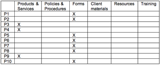
The data looked like this:

Grid with participants in the left column and Xs for where participants visited or entered in the other columns

Seven of the 10 started out at Forms – great. That’s what the team expected based on the outcomes of card sorts. But 3 participants didn’t. But those 3 all started out at the same place. (First inference: Now the team knows there is strong scent in one link and some scent in another link.)


Example 2: Tracking navigation paths – defining “wrong turn”

Now, what about the wrong turns? In part, this depends on how the team defines “wrong turn.”

What you’re finding out in exploratory tests with early designs is where users go. Is that wrong? Not necessarily. Think of it in the same way that some landscapers and urban planners do about where to put walkways in a park. Until you can see where the traffic patterns are, there’s not a lot of point in paving. The data will tell you where to put the paths outside where the team projects the path should be.

As each session goes on, the team tracks where participants went. The table below actually tracks the data for multiple issues to explore:

  • How many wrong turns do they take on the way?
  • Where in the navigation do they make wrong turns?
  • How easily and successfully do they recognize the form they need on the gallery page?


Everyone ended up at the right place. Some participants even took the path that the team expected everyone to take: Forms / Account Open / Form #10.

But the participants who started out at Products had to go back to the main navigation to get to the right place. There’s a decision to make. The team could count those as “wrong turns” or they could look at them as a design opportunity. That is, the team could put a link to Forms on the Product page – from the point of view of the user, they’re still on the “right” path and the design has prevented the user from making a mistake.

Account Open is a gallery page. Kits is the beginning of a wizard. Either way, the right form is available in the next step and all the participants chose the right one.


Measures: Everything counts

So, how do you count what counts? The team counted errors (“wrong turns”) and task successes. How important are the counts? The team could have gone with their impressions and what they remembered. There’s probably little enough data to do that. In smaller tests, your team might be comfortable with that. But in larger tests – anything over a few participants – observers typically remember the most recent sessions the best. Earlier sessions either fade in memory or the details become fuzzy. So tracking data for every session can keep the whole team honest. When there are numbers, the team can decide together what to do with them.


What we saw

This team learned that we got the high-level information architecture pretty close to right – most participants recognized where to enter the site to find the forms. We also learned that gallery pages were pretty successful; most participants picked the right thing the first or second time. It was easy to see all of this in tracking and counting what participants did.

Consensus on observations in real time: Keeping a rolling list of issues


Design teams often need results from usability studies yesterday. Teams I work with always want to start working on observations right away. How to support them while giving good data and ensuring that the final findings are valid?

Teams that are fully engaged in getting feedback from users – teams that share a vision of the experience they want their users to have – have often helped me gather data and evaluate in the course of the test. In chatting with Livia Labate, I learned that the amazing team at Comcast Interactive Media (CIM) came to the same technique on their own. Crystal Kubitsky of CIM was good enough to share photos of CIM’s progress through one study. Here’s how it works:


1. Start noting observations right away

After two or three participants have tried the design, we take a longer break to debrief about what we have observed so far. In that debrief, each team member talks about what he or she has observed. We write it down on a white board and note which participants had the issue. The team works together to articulate what the observation or issue was. Continue reading Consensus on observations in real time: Keeping a rolling list of issues

Looking for love: Deciding what to observe for


The team I was working with wanted to find out whether a prototype they had designed for a new intranet worked for users. Their new design was a radical change from the site that had been in place for five years and in use by 8,000 users. Going to this new design was a big risk. What if users didn’t like it? Worse, what if they couldn’t use it?

We went on tour. Not to show the prototype, but to test it. Leading up to this moment we had done heaps of user research: stakeholder interviews, field observations (ethnography, contextual inquiry – pick your favorite name), card sorting, taxonomy testing. We learned amazing things, and as our talented interaction designer started translating all that into wireframes, we got pressure to show them. We knew what we were doing. But we wanted to be sure. So we made the wireframes clickable and strung them together to make them feel like they were doing something. And then we asked (among other things): Continue reading Looking for love: Deciding what to observe for

Popping the big question(s): How well? How easily? How valuable?

When teams decide to do usability testing on a design, it is often because there’s some design challenge to overcome. Something isn’t working. Or, there’s disagreement among team members about how to implement a feature or a function. Or, the team is trying something risky. Going to the users is a good answer. Otherwise, even great teams can get bogged down. But how do you talk about what you want to find out? Testing with users is not binary – you probably are not going to get an up or down, yes or no answer. It’s a question of degree. Things will happen that were not expected. The team should be prepared to learn and adjust. That is what iterating is for (in spite of how Agile talks about iterations).

Ask: How well
Want to find out whether something fits into the user’s mental model? Think about questions like these:

  • How well does the interaction/information information architecture support users’ tasks?
  • How well do headings, links, and labels help users find what they’re looking for?
  • How well does the design support the brand in users’ minds?

Ask: How easily
Want to learn whether users can quickly and easily use what you have designed? Here are some questions to consider:

  • How easily and successfully do users reach their task goals?
  • How easily do users recognize this design as belonging to this company?
  • How easily and successfully do they find the information they’re looking for?
  • How easily do users understand the content?
  • How easy is it for users to understand that they have found what they were looking for?
  • How easy or difficult is it for them to understand the content?

Ask: How valuable

  • What do users find useful about the design?
  • What about the design do they value and why?
  • What comments do participants have about the usefulness of the feature?

Ask: What else?

  • What questions do your users have that the content is not answering?
  • What needs do they have that the design is not addressing?
  • Where do users start the task?

Teams that think of their design issues this way find that their users show them what to do in the way they perform with a design. Rarely is the result of usability testing an absolute win or lose for a design. Instead, you get clues about what’s working – and what’s not – and why. From that, you can make a great design.

Thinking inside the right box: Developing tasks for usability test participants

One question I get in workshops on usability testing is How do I get participants to do the tasks I want them to do?

On further discussion, we find (the attendee and I) that this question is really asking two things:

  • How do I use usability testing to exercise the design?
  • How do I motivate users to try things I want them to try?

Thinking outside-in versus thinking inside-out

Teams get to a point where they have to make decisions or settle disagreements about which direction to go with a design. The natural – and good – thing is to go to the users and collect a little data. You have this thing you want to test. This is thinking from the inside out, from the point of view of the system or design you’re working on.

Users have goals they want to reach. So, you have to think from their point of view – that is, from the outside, looking in.

It’s easy to get caught up in asking test participants to try particular design features without fitting that trying-out into a realistic situation for the participant. Teams do it all the time. Here’s example of inside-out thinking in setting up a task:

Task for the participant from the designer’s point of view: We’ve added a map to our search so you can see where our product outlets are. Here. Try it out and tell us what you think.

You watch and listen, but what happens? The data is about a reaction to something that is out of context of use. Here’s a response from a test I did in a similar situation:

Participant response:

That’s cool. I like the idea of having a map. This one looks good. But I don’t know that city, so I don’t know what these locations are in relation to. Hmm. And look, the little numbers in the bubbles show me… something. What are they numbered from? What makes one number 1 and another one number 10? When I hover over those bubbles, it shows me more information, but I can’t see the other locations on the map now.

What do you do now?

Compare that situation to this.

Task scenario for the participant from a user’s point of view: Ever had problems with your cell phone? Okay, imagine that you’re in a city other than the one you live in. You’re there visiting your family (insert appropriate occasion here), so you don’t know where the stores are where you could take your phone to be fixed or exchanged. But you do have access to the Web. What do you do now?

Participant response:

Man, I’ve had that happen. First, I went to the site for the company I get service through. This isn’t my computer so I don’t have bookmarks set up to go to my account. Okay, so I type in the main site address and then I look for some way to find retail locations. I’m on the site now, but I’m not seeing what I’m looking for. Do I have to log in first? No, that would be stupid. They wouldn’t make me do that, would they? Where’s the link for stores? I swear I’ve used it before. Huh. Oh, here it is at the top. It’s a tiny link. Click. I’m there. Great. I’m going to enter my mother’s zip code to see where the stores are near her. Woo! I got a map. Cool. I can instantly see where there are locations within range. I don’t know the neighboring towns very well, though, so I’ll have to zoom in at some point. Hmmm. What’s the address of the nearest store? I need directions now…

See how much richer that data is? Let us deconstruct what’s going on here.

The task scenario sets up a situation that the participant can relate to and you hope he’s motivated to do, and leaves it open-ended. (You can adjust the scenario to fit the participants’ experiences and motivations and still get consistent data across participants.) This way, you can see much more natural behavior, thought processes, and performance. And you get some seriously cool stuff along the way.

First, you learn that the participant goes to the site enough to bookmark it in the browser. You also got help with your information architecture, in trigger words for labels: “retail locations” and “stores.” The participant is telling you the vocabulary he uses to articulate the task goal. You want to use those words in your interface and search terms.

Next, you observe that the way to get to store locations on the site isn’t immediately obvious because the participant doesn’t see it right away and wonders if he has to log into an account. This may be an artifact of the task, or it may be a design issue. Over a few sessions, you should be able to tell whether the position, size, design, or proximity of the widget should be changed.

Then, he enters a zip code to get to a map. That works. The participant’s interaction with the map tells you that he grocked it right away. At a glance, he got what he needed and it made sense. Yay for you!

Now he’s using the map in his context to reach his goal. You can use what happens next to further refine your design.

It’s okay to start out thinking about tasks by localizing test scenarios to certain areas of the design as long as you turn them around to look at the localized design problems from the larger point of view of the user – from the outside, in.
Yes or No: Make your recruiter smarter

In response to my last post about writing effective screeners, c_perfetti asks:


I agree open-ended questions in a screener are best.

But one reason some usability professionals use ‘yes/no’ questions is because they don’t have confidence that the external recruiters can effectively assess what an acceptable open ended answer would be.

In some cases, they may find that asking a ‘yes/no’ question is the safer approach.

How would you handle this concern?

You asked a great open-ended question! What you need is a smarter recruiter.

There are two things you can do to make your recruiter smarter: brief her on the study, and give her the answers.

Brief your recruiter

Basically what we’re talking about is giving your recruiter enough literacy in the domain you’re in to be intelligent when screening rather than a human SurveyMonkey. You can make them work smarter for you by doing two things:

  • Spend 15 minutes before the recruit startsexplaining to the recruiting agency the purpose and goals of the study, the format of the sessions, what you’re hoping to find out, and who the participant is. For this last, you should be able to give the agency a one- or two-word envisionment of the participant: “The participant has recently been diagnosed with high cholesterol or diabetes or both and has to make some decisions about what to do going forward. She hasn’t done much research yet, but maybe a little.” 
  • Insist that the agency work with you. Tell them to call you after the first two interviews they do and walk through how it went. Questions will come up. Encourage them to call you and ask questions rather than guessing or interpreting for themselves.

With this training done, you can trust your recruiting agency a bit more. If you continue to work with the agency, over time they’ll learn more about what you want, but you’ll also have a relationship that is more collaborative.

Tell the recruiter what the answers might be

Now, to your question about Yes/No.

Using Yes/No leads to one of two things: inviting the respondent to cheat by just saying “yes!” or scaring the respondent into giving the “wrong” answer because it might be bad or embarrassing to give the “right” answer. In the screening interview, this can be scary or accusatory to the respondent: “Do you have high cholesterol?” (And saying “no” would disqualify him from the study.) Or just super easy to say “yes” because the question is too broad or ambiguous. “Do you download movies from the Web?” could be stretched to mean ‘watch videos on YouTube,’ or bit torrenting adult entertainment, but what it means is ‘Do you use a service from which you get on-demand or instant access to commercial, Hollywood movies and then watch them?’

If it’s the main qualifier for the study – Do you do X? – that can be avoided by putting out the call for participants the right way. Check the headlines on craigslist.org (usually in Jobs/ETC or in Volunteers), for example. There you’ll see pre-qualifying titles on the postings, and that’s the place to put the question, “Do you have high cholesterol?” or “Do you use a headphone with your mobile phone?” You still have to verify by asking open-ended questions.

If you find yourself wanting to ask a Yes/No question:

  • Craft an open-ended question and provide what several possible right answers might befor the recruiters to use as reference (but not something they should read to respondents). Possible alternative script for the recruiter: 


“Tell me about the last cholesterol test you had. What did the doctor say?”
[Recruiter: Listen for answers like this
___ He said that I’m okay but I should probably watch what I eat and get more exercise. My total cholesterol was .
___ He said that if I didn’t make a change I’d have to start taking meds/a prescription/away my cheese. My total cholesterol was .
___ He said that I am a high risk for heart disease. I could have a heart attack. My total cholesterol was ]

  • Think of one key question that would call the respondent out on fibbing to get into the study. For a gaming company, we wanted people who had experience with a particular game. Anyone can look up the description of a game online and come up with plausible answers. We added in a question asking what the respondent’s favorite character was and why. Our client provided a list of possible answers: names and powers. The responses were fascinating and indicated deeper knowledge of the game than a cheater could get from the cover art or the YouTube trailer.

The short answer: You should still avoid Yes/No questions in screeners. First, think about what you’re really asking and what you want to find out by asking it. Is it really a yes/no question? Then train your recruiter a little bit beforehand, and anticipate what the answers to the open-ended questions might be.

Why your screener isn’t working

I get that not every researcher wants to or has time to do her own recruiting of participants. Recruiting always seems like an ideal thing to outsource to someone else. As the researcher, you want to spend your time designing, doing, and analyzing research.

So, you find an agency to do the recruiting. Some are very appealing: They’re cheap, they’re quick, and they have big databases of people. You send requirements, they send a list of people they’ve scheduled.

How do you get the most out of an agency doing the recruiting? Write a great screener — and test it. How do you get a great screener? Here are a few tips.

Seven screener best practices

  1. Focus questions on the behavior you want to see in the test. For example, for a hotel reservations website, you might want to know Does the person book his own travel online? For a website for a hospital network, the behavior might be Does the person have a condition we treat? Is the person looking for treatment?
  • Limit the number of questions.If the question does not qualify or disqualify a respondent for the study, take the question out. If you want to collect information besides the selection criteria, develop a background questionnaire for the people selected for the study.
  • Think about how you’re going to use the data collected from the screener.Are you going to compare user groups based on the answers to screener questions? For example, if you’re asking in your screener for people who are novices, intermediates, and experts with your product, are you actually going to have a large enough sample of participants to compare the data you collect in the usability test? If not, don’t put requirements in your screener for specific numbers of participants with those qualities. Instead, ask for a mix.
  • Avoid Yes/No responses. This is difficult to do, but worthwhile. Yes/No questions are very easy for respondents to guess what the “right” answer is to get into the study. In combination, a series of gamed Yes/No responses can make a respondent look like he fits your profile when he really doesn’t.
  • Ask open-ended questions if at all possible.This gets respondents to volunteer information in answer to a real question rather than picking the “right” choice from a list of options that the recruiter reads to them. You can give the recruiter the choices you think people will come up with and a pick list for the recruiter to use to note the data. But the recruiter should not read the list to the respondent. For example, on the hospital website, you might ask, “Tell me about your health right now. What were the last three things you visited a doctor for?”
  • Avoid using number of hours or frequency as a measure of or a proxy for expertise.I was looking for tech savvy people for one study. One respondent told us she spent 60 hours a week on the Web. When she got into the lab, it was clear she didn’t know how to use a browser. When I asked her what she does on the Web, she said this computer didn’t look like hers at all. That she starts in a place where she clicks on a picture and it brings up her favorite game. Turns out, her son-in-law had set up a series of shortcuts on her desktop. She knew the games were on the Web, but that was all she knew about the Web.
  • Watch the insider jargon. If you’re using industry or company terms for products or services that you want to test, you may prime respondents for what you’re looking for and lead them to giving the right answer. Again, open-ended questions can help here. This is where you start looking at your product from the user’s point of view.


Need help developing a screener? Need help with doing recruiting? Contact me about recruiting services my company offers. We’ve got a great process and a 90% show rate.

Testing in the wild defined

Lately I’ve been talking a lot about “usability testing in the wild.” There are a lot of people out there who make their livings as usability practitioners. Those people know that the conventional way to do usability testing is in a laboratory setting. If you have come to this blog from outside the world of user experience research, that may never have occurred to you.

Some of the groups I’ve been working with recently do all their testing in the wild. That is, they never set foot in a lab, but instead conduct evaluations wherever their users normally do the tasks the groups are interested in observing. That setting could be a grocery store, City Hall, on the bus, or at a home or workplace – or any number of other places.

A “wild” usability test sometimes has another feature: it is lightly planned or even ad hoc. Just last night I was on a flight from Boston to San Francisco. I’ve been working with a team to develop a web site that lists course offerings and a way to sign up to take the courses. As I was working through the navigation and checking wireframes, the guy in the seat next to me couldn’t help looking over at my screen. He asked me about the site and the offerings, explaining that they looked like interesting topics. I didn’t have a prototype, but I did have the wireframes. So, after we talked for a moment about what he did for a living and what seemed interesting about the topics listed, I showed him the wireframe for the first page of the site and said, “Okay, from the list of courses here, is there something you would want to take?” He said yes, so I said, “What do want to do next, then?” He told me and I showed him the next appropriate wireframe. And we were off.

I learned heaps for the team about whether this user found the design useful and what he valued about it. It also gave me some great input for a more formal usability test later. Testing in the wild is great for early testing of concepts and ideas you have about a design. It’s one quick, cheap way to gain insights about designs so teams can make better design decisions.